THE TASK
There are few restaurants these days that are truly “immersive,” transporting customers into a world that creates a memorable and unique experience. As the final project for my senior-year course Graphic Design: Brand Experience, students were tasked with inventing a unique restaurant concept and guiding it from ideation to production.

THE BRAND
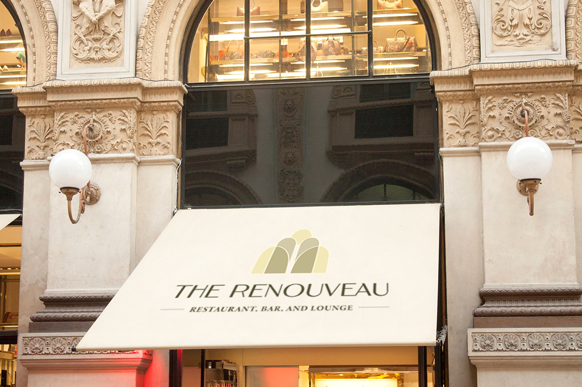
As an avid Pinterest user, my feed is always filled with dazzling Art Deco-inspired art, interior design, and architecture. I knew I wanted to create a restaurant that encapsulated this artistic aesthetic. At The Renouveau (French for The Revival), customers will immerse themselves in the glitz and the glamor of Old Hollywood, getting transported back to the Golden Age of culture through a high-end dining experience. With a 1920’s Deco-inspired interior, a live jazz ensemble on weekends, and a cocktail menu that honors iconic movie stars of the time, The Renouveau creates an atmosphere that is nothing short of allure and sheer elegance.
THE LOGO
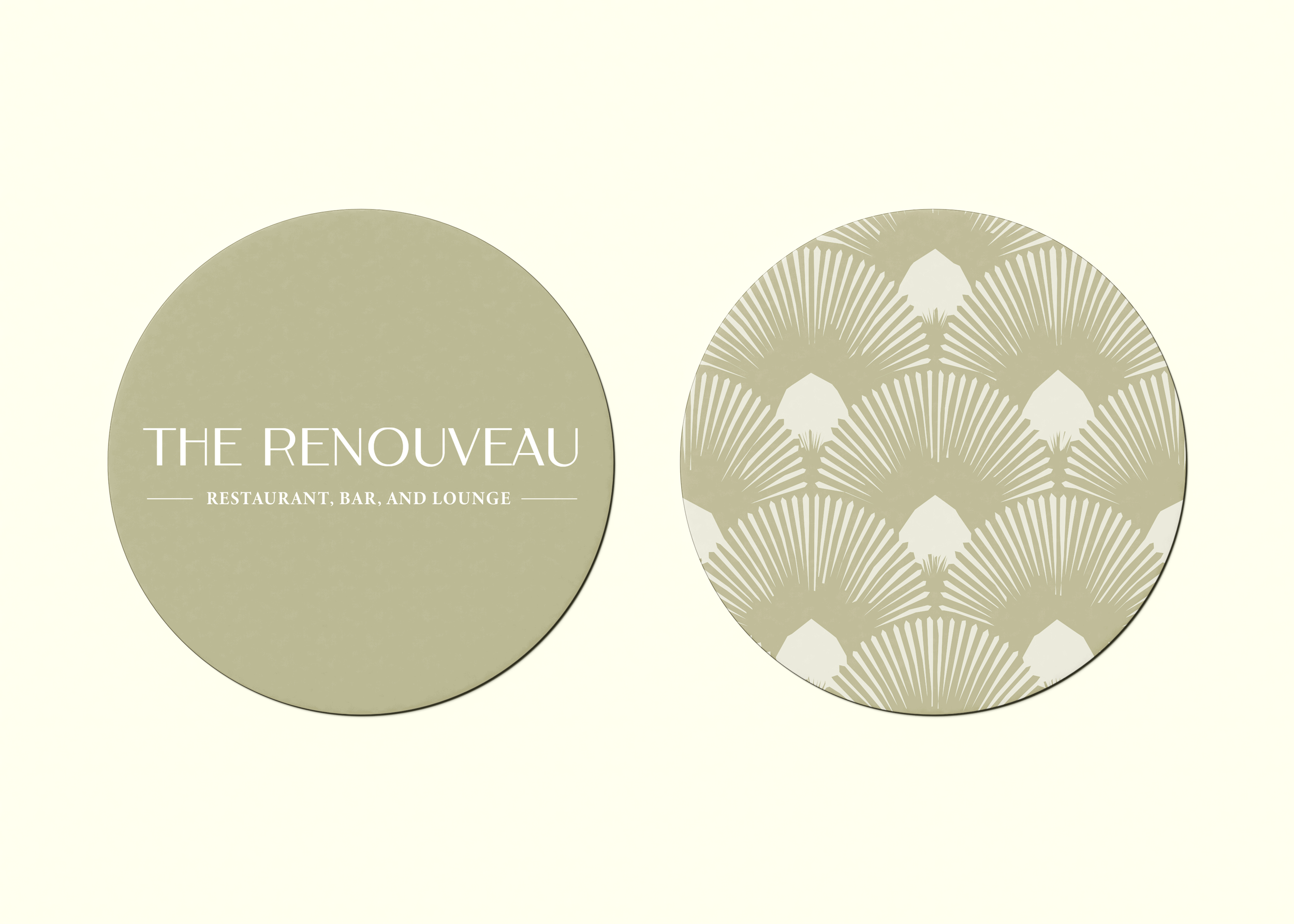
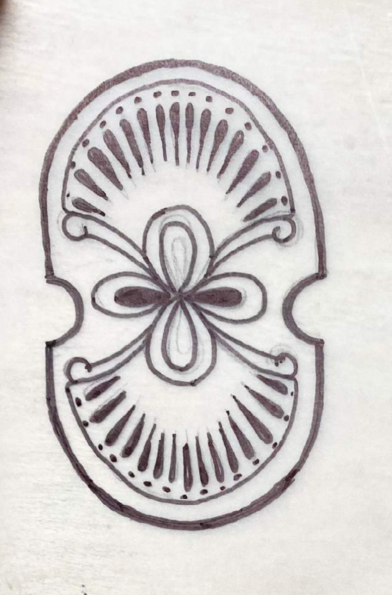
From the start, I knew I wanted my logo to be a decorative emblem, such as the Lattz Travel Group logo that I used as initial inspiration. I sketched a bunch of decorative emblems, including a variety of both rounded and vertical lines, both indicative of Art Deco’s key architectural elements.


I vectorized those that I was happiest with, and through the vectorization process, I narrowed it down to two possibilities (below). I went with the one on the right, as I felt that its rounded vertical elements were more representative of Deco style and architecture while still offering a contemporary feel.


THE ATMOSPHERE
Below are some photos I found from Pinterest as inspiration for The Renouveau’s interior, patterns, and overall design aesthetic. Pink and green appeared frequently throughout my mood board. My original color palette aimed to include both of these; however, I ended up selecting a final color palette of monochromatic greens and chartreuses for a more sophisticated feel.


THE BRANDING

THE MENUS
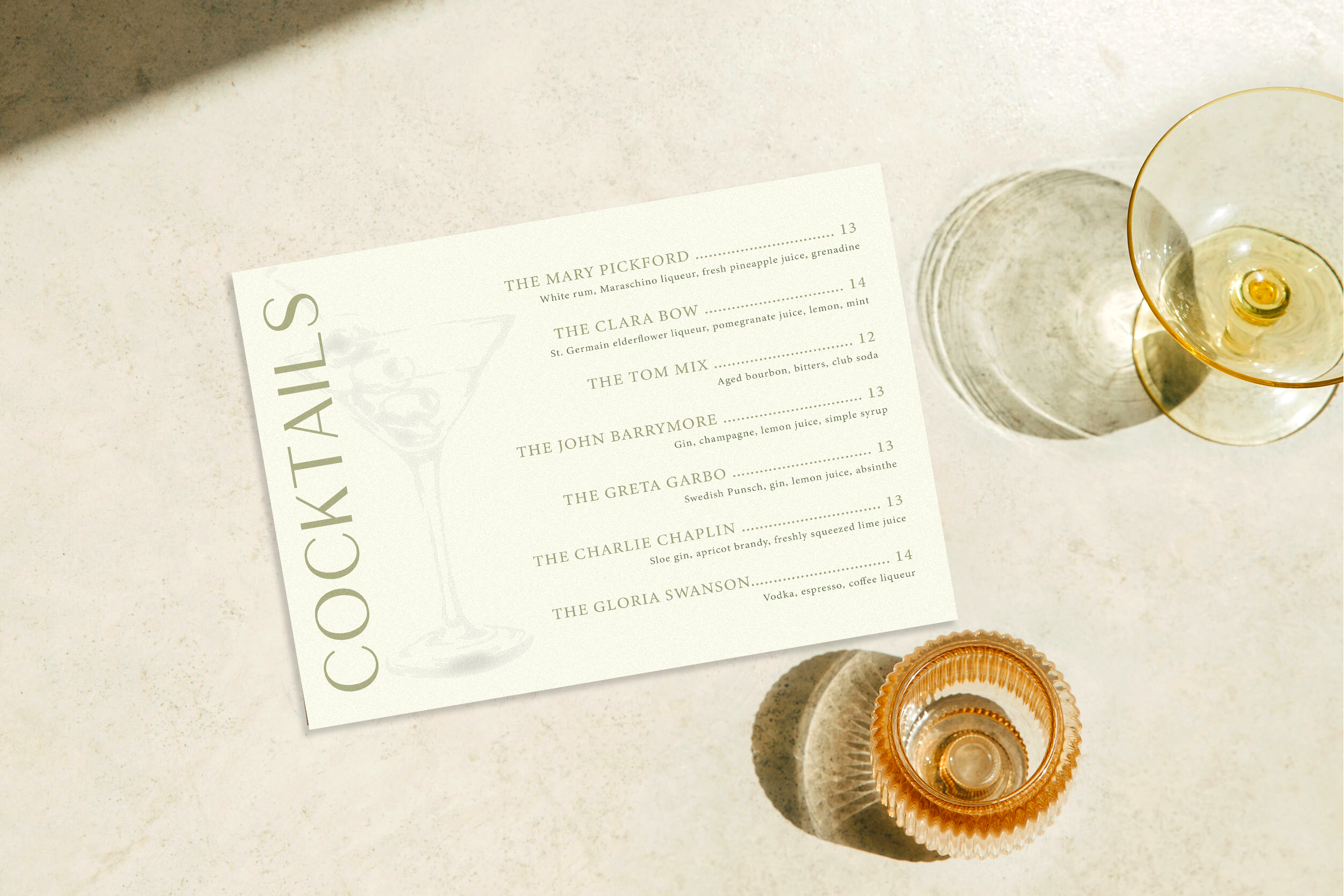
I aimed to keep my restaurant’s menus as simple and sophisticated as possible. I kept the number of menu items light to keep the information hierarchy clean and easy to read. I struggled to find mockups that I felt represented my brand, so instead I Photoshopped all three of my menus into free stock photos that I found online.


ADDITIONAL COLLATERAL