
If you were a shoe style, what style would you be?
This is the question I was posed at the start of my most recent project. For as long as I can remember, sustainability has been a core value of mine. In high school, as I started becoming more interested in fashion, I noticed a common theme across the market—the sustainable options are not very stylish, and the stylish options are far from sustainable. So, how can I combine the hip stylishness of fast fashion without the harmful carbon emissions, excessive waste,
microplastic pollution, and inhumane working conditions? We know that the fast fashion market thrives on two things: cheap, poor-quality materials (so consumers are constantly in need of replacements) and the seemingly never-ending cycle of fashion trends. Therefore, in order to put an end to this cycle, a product has to be both durable and timeless.
Introducing Terra.

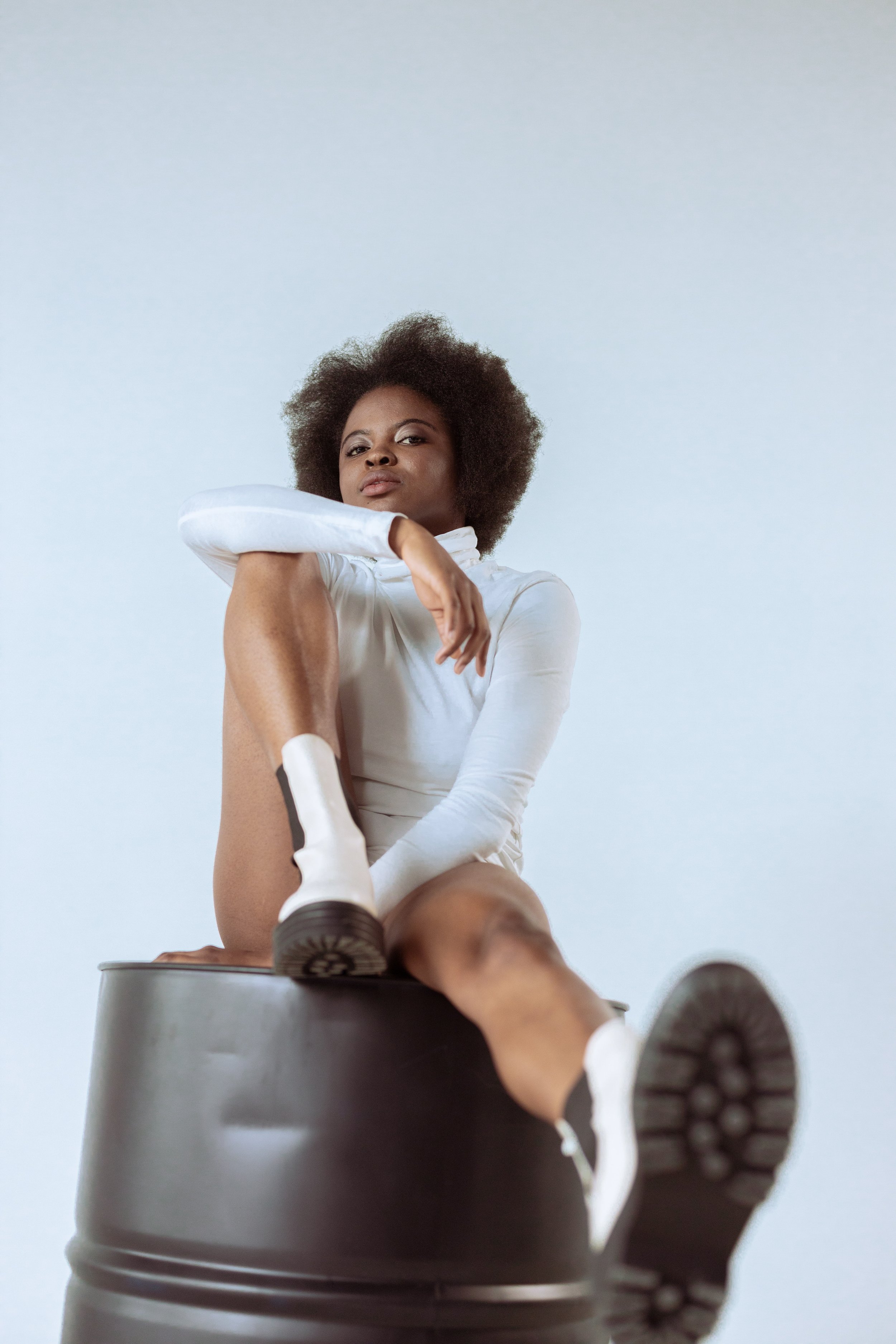
Terra is a sustainable, anti-fast fashion (… slow fashion perhaps?) clothing and shoe brand whose mission is to marry style and sustainability. Terra focuses on offering timeless, stylish pieces that withstand the test of time, both physically and stylistically. Constructed with durable, recycled eco-materials and designed with simplicity and versatility in mind, Terra products are timeless staples built to last a lifetime.

BRAND PURPOSE
A sustainable, eco-friendly clothing & shoe company that focuses on stylish pieces that will never wear out because:
They are made with durable eco-materials
The pieces are simple and versatile, making them a timeless staple
Unique Selling Proposition (USP):
The footwear that reduces your carbon footprint, without compromising style.
PERSONA
Female-identifying people who value sustainability, but don’t want to compromise style
They like the idea of shoes that are made out of recycled materials, but they don’t like the look of what’s currently on the market
LOGO DEVELOPMENT


FINAL LOGOS + BRAND GUIDELINES
Below are the final logos for both Terra (my parent company) and Arlie (my boot line), as well as branding colors + fonts. The second “R” in the Terra logo is reflected over the y-axis and overlapped over the first “R” to create a hidden Venn diagram visual, representing the intersection of style and sustainability. I stuck with a neutral color palette, as I want my line to be as versatile and timeless as possible while also appealing to a diverse range of consumers

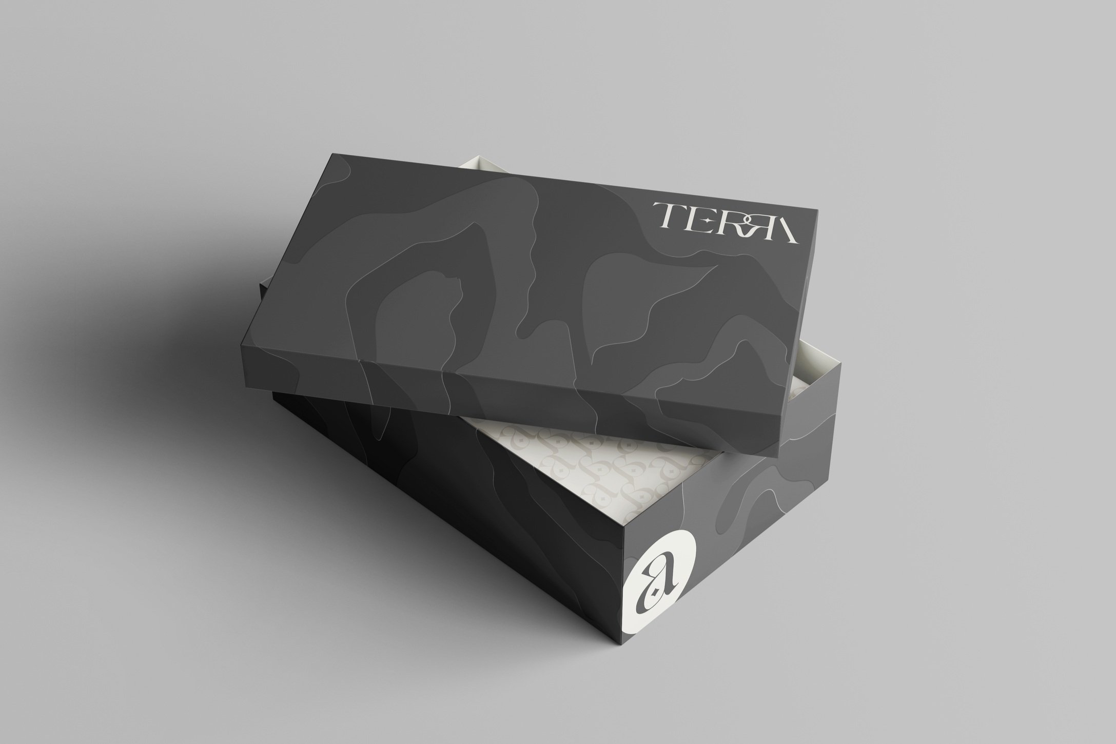
PACKAGING
For the Arlie boot’s packaging, I was inspired by topography maps for an earth-inspired yet clean, sophisticated feel. In order to maintain visual interest even with the lack of color within my palette, I opted for unique print processes instead—such as the embossed edges for some added texture. All of Terra’s packaging is produced with 100% recycled paper.


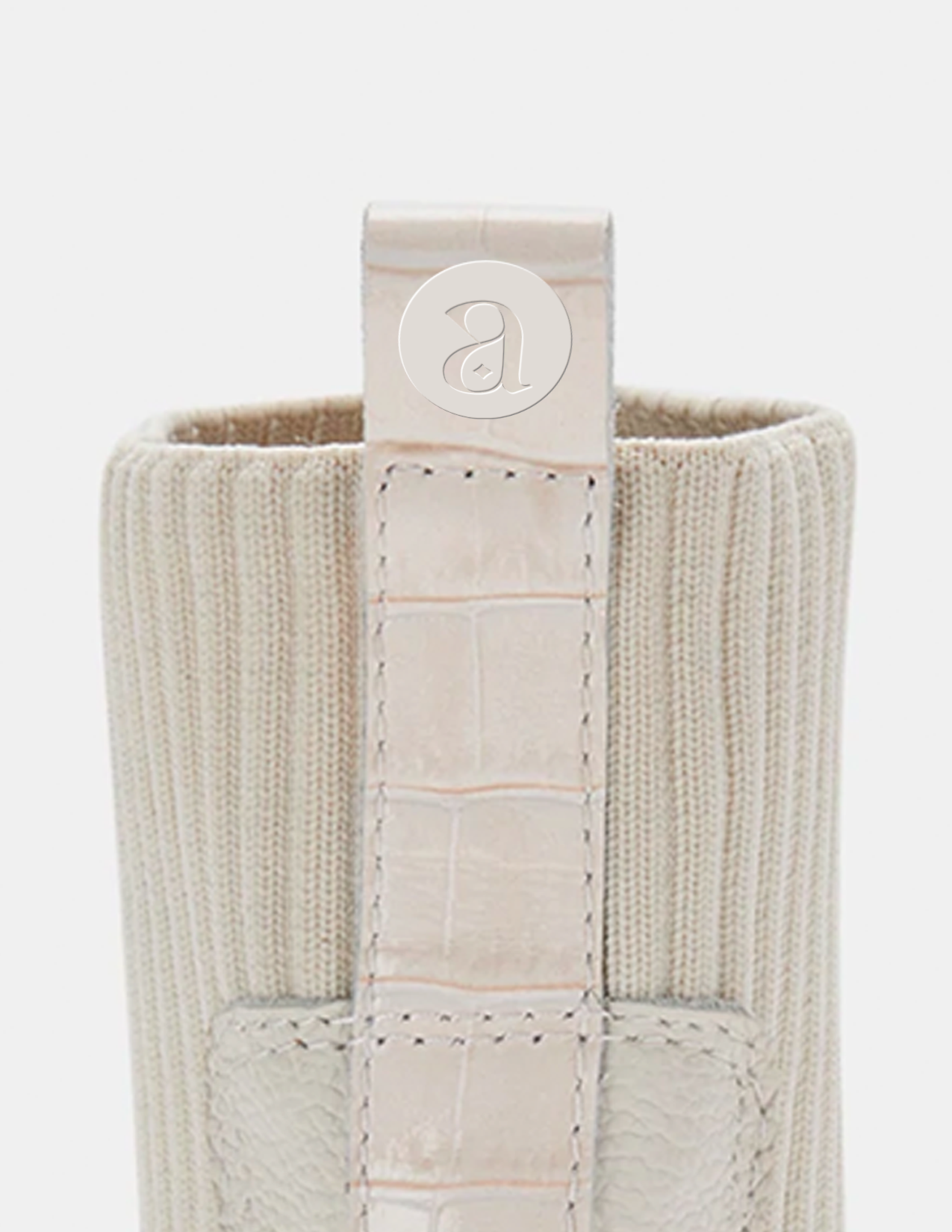
BOX INSERT

CLOTHING SAMPLES

ADVERTISING
To see the marketing campaign I designed for Terra, please refer to my Advertising page.